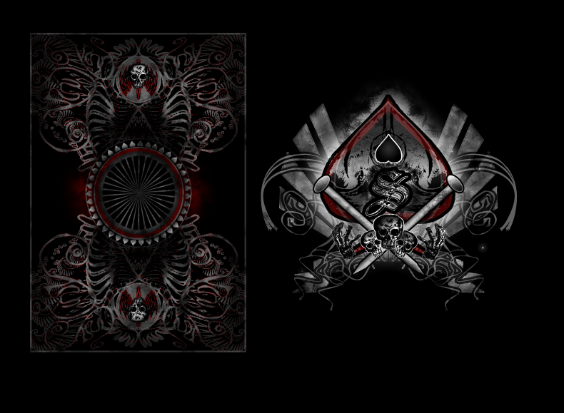
Card Back Design

Sep 1, 2007
378
0
UK
Last edited by a moderator:
Aug 31, 2007
77
1
needs more elegance to it, the overall design is so busy and the ace is too chaotic, not bad but I think they could be toned downa bit.
 
IMO for the ace, there is a ribbon of white coming out of the S. It would look a lot better if you got rid of that ribbon. It looks to cartoonish with it there.
Hope you understand what i'm saying because its hard to describe.

Other than that the backs look awesome but it might need something in the middle. Not really sure. Good Job
 
Sep 1, 2007
378
0
UK
needs more elegance to it, the overall design is so busy and the ace is too chaotic, not bad but I think they could be toned downa bit.

We clearly have different tastes. :p
I saw your smoke and mirror's edit, but it just looked too simple for me. xD

Huruey
 
May 2, 2008
753
0
Pennsylvania
:D

Awesome cards! 5/5 from me, I would buy these ;)

Really nice work, although I would like to see white instead of a greyish color on the back, I don't like my cards to be TOO spooky :p
 
May 8, 2008
360
0
England
Safe. I like them, maybe something needs doing to the middle, don't really know what... But other than that love the back design. Are you actually going to get some of these printed?

Yeah the Ace is kinda busy... Guess it's all down to personal preference.

Very nice job, backs are sweet :)

-S
 
Jan 21, 2008
21
0
If you're going for a spooky gothic look, then you've got it. I personally don't like it but that's just our difference in taste. Either way, they are very well crafted.

I'm not sure if this is what insert.username.here meant before, but I think that ribbon at the bottom of the spade, almost right below the S that protrudes to either side looks kinda pasted in. I'd change the styling of this and then make it more muted.

Also I think the gradient that you used to texture the nails looks too plain. I think that you should add more texture to them.

All in all, I think they're really good and my pointers are insignificant with all the things I really liked about their workmanship. Keep it up.
 
Sep 1, 2007
378
0
UK
I'm definitely going to be rusting up the nails a bit. I was thining about putting something in the middle, also, but I think like this it looks a lot better when you spin the card, as the middle almost seems to stay still as the rest of the card spins.

Thanks for the feedback.

Huruey
 
Jul 15, 2008
167
1
methinks the back needs some blood red... very little blood red, but some blood red indeed.
 
Sep 1, 2007
378
0
UK
I think they are well done, but not a very original ace design. It just looks like a tweaked masters ace with the centurion skulls.

Good job on it, just not very original imo.

j

I think the word "tweaked" is a little harsh. :p Especially seen as most people who "design" cards just grab pictures from the internet and stick them all together, whereas I make an effort to do everything from scratch. Those "centurion skulls" were hand drawn with my mouse, and the only similarity I can see between my ace and the masters is that it uses both red and black. :p

Huruey
 
Sep 1, 2007
378
0
UK
I've posted new developments. I have shifted deeper into a horror theme. There does seem to be a lack of this kind of deck available, though. :p

Huruey
 
Jan 21, 2008
21
0
I looks really good. If this were my style, I would seriously want these.

Perhaps this is just my opinion, but I liked the winged guys on the top and bottom circles on the backs better than the skulls.

One more suggestion about these skulls is that they stand out too much. They're a great detail, but their contrast compared with the contrast of the rest of the back seems to take too much attention, and I personally like the center of the deck of cards to be the focal point rather than the top and bottom. Do you get what I'm saying?

They look great (not as great as the winged guys in my opinion) but I just think that they should be darkened and muted just a little bit so they don't jump out of the design too much.

The red that you added to the back design looks killer.

I like that you added texture to the nails, but I still feel like they need a bit more. And the same deal goes with that black upside-down heart in the middle of the spade. It just looks too smooth in a design that's very detailed and rough.

Those are just my opinions and if you're happy with it the way they are, then go for it. It looks really good as it is anyway.

Hope this helped.
 
Jul 12, 2008
192
0
Kendal
I have got to agree that they would be better with something in the middle I'm afraid, but you could make it something trademark to you that just says you entirely (even if it's only initials like Dan n Dave do) Also I think the ace would be good without the hands on it. Apart from that it's fantastic though. I really would buy these.
(Also if you made something trademark on the back, you could make more decks and sell them to the hundreds who'd want to buy their own... OK that did sound a little gay)
 
Searching...
{[{ searchResultsCount }]} Results