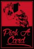
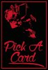
The graphic itself draws the viewer's eye down at a diagonal, and the stair-step approach you made to the text relates with this diagonal idea that connects the two together. The change from "pick a card" to this new phrase I think works better because the graphic appears to be more of a reveal rather than a selection about to be made.
At first I was unsure why some of the letters were a different value, but then I saw that you incorporated another phrase and the value change helps to distinguish the phrase. Not sure if a lot of people will understand it right away but it's a clever idea.
There are just some small things you could fix. The line weights appear to be inconsistent for the border on each side. Be sure that they are all the same thickness. Also, the question mark is way too close to the red border. This creates tension in the composition and does not allow white space to flow through. Simply move the word a little to the left.
Overall it's coming along great!