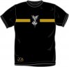
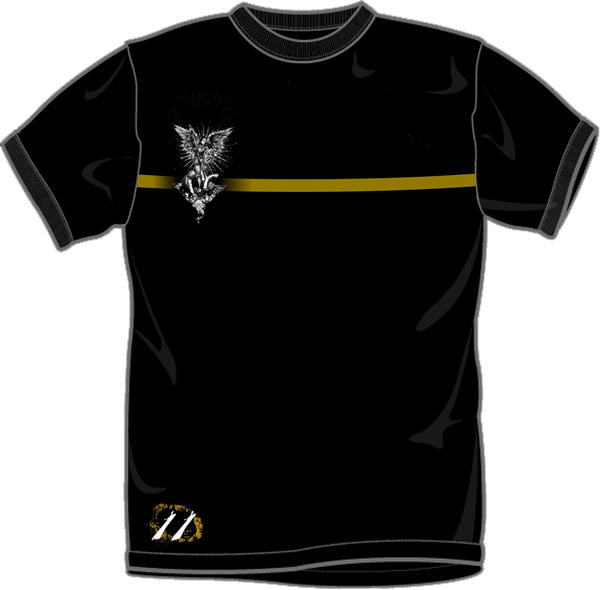
Opinions on my T-Shirt Design, Please?

Sep 14, 2007
45
0
Hey everyone,

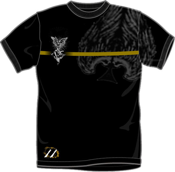
I was given a project in my digital media class at school to design a t-shirt, so I distinctively thought of theory11. :p

There were two more, but they were just a white shirt and a black shirt, and the whole shirt was basically covered by the figure on the joker in the guardian deck.

But here is the one I made for the class. What do you think?

Thanks, Shane.
 

Attachments

  • Theory11 Shirt.jpg
    Theory11 Shirt.jpg
    195.2 KB · Views: 141
Sep 1, 2007
662
2
Actually, I think that's kinda cool. I'm not sure that the horizontal bar really "fits" with the central image, but it does seem to work. Maybe it would hang together more if the image was off centre?

Good job though.
 
Jan 5, 2008
36
0
Drury Lane
Alright since you asked for opinions, I'll give you mine.

I really like how you chose to add the Joker into the design, with the theory 11 logo on the bottom.
But the plain yellow stripe just draws the attention away from the rest of the shirt.
Distribute the stripe to balance it out. Don't just put a single one if you want the stripe to stay that bright. Make it turn or curve, and fade it at certain points.
Also, make the shirt look vintage and worn out. (Like I said before, I really don't like the stripe style.)

Check out the attachment. My art teacher explains how you have to draw the viewer's eyes away from the center. Shading in different styles causes a feeling and emotion.

Notice how not a single line passes through the whole picture?
This would make an oversized border. It would cut off the rest of a picture like a wall.

Also, take into consideration optical illusions, such as how white on black is different from black on white.

If you're really serious about this, then pay attention to this.
But I mean, don't get offended. I'm just trying to help.

Tell me how it goes!

mm~
 

Attachments

  • abstract.JPG
    abstract.JPG
    143.3 KB · Views: 101

The Dark Angel

forum moderator / t11
Sep 1, 2007
2,003
18
32
Denver, Colorado
The Joker looks pixelated, and I think that the yellow line should be either thinner or a darker shade so as not to be so eye-catching, as the focus of attention should be on the Joker.

Good job!
TDA
 
Sep 1, 2007
648
0
31
Canada
Here's my opinion.

You have the right idea, but there are a few things you should tweak. First, kill the inverted Joker. It would look much better white. What I would have done was take the Joker, turn the black outlining into a lighter shade of grey, and blow it up about 5x. If you move what you have there off to the left, so that about 1/4 is cut off, it would look awesome.


Edit - Sort of like this...
 

Attachments

  • JokerT.JPG
    JokerT.JPG
    36.9 KB · Views: 104
Last edited by a moderator:
Sep 1, 2007
1,699
1
34
It would be cool if you maybe superimposed the Guardian Ace in a dark gray over the entire thing. Might add some texture. And I agree about the off-center thing.
 
Oct 24, 2007
314
0
Alright since you asked for opinions, I'll give you mine.

I really like how you chose to add the Joker into the design, with the theory 11 logo on the bottom.
But the plain yellow stripe just draws the attention away from the rest of the shirt.
Distribute the stripe to balance it out. Don't just put a single one if you want the stripe to stay that bright. Make it turn or curve, and fade it at certain points.
Also, make the shirt look vintage and worn out. (Like I said before, I really don't like the stripe style.)

Check out the attachment. My art teacher explains how you have to draw the viewer's eyes away from the center. Shading in different styles causes a feeling and emotion.

Notice how not a single line passes through the whole picture?
This would make an oversized border. It would cut off the rest of a picture like a wall.

Also, take into consideration optical illusions, such as how white on black is different from black on white.

If you're really serious about this, then pay attention to this.
But I mean, don't get offended. I'm just trying to help.

Tell me how it goes!

mm~

Your art teacher is right, but that's for art. Not for design. T-Shirt designs are that, designs. I study graphic design and web designs and just designs all together. In a design you want the picture to keep the focus on the center, so that people are always drawn in. You don't want them straying off. So, the shirt should have a focal point that draws to it. Not off of the side of a picture. Anyway, that's my opinion. Peace!

Tyler
 
Trioxide,

Do you have to design the back of the shirt as well? Because if you used Longman's idea except fitted the Ace so it spread across the whole back of the shirt. That would be a nice added touch.

Longman said:
It would be cool if you maybe superimposed the Guardian Ace in a dark gray over the entire thing. Might add some texture. And I agree about the off-center thing.

-RA69
 
Sep 14, 2007
45
0
Thanks for your opinions everyone. :D

I'll take into consideration all the ideas. I probably won't be able to work on it tomorrow, but I'll try to get an updated picture up before...hmmm...thursday, maybe?

Now that I take a look at it, I see what everyone is saying about the line. I'm going to make it smaller, and maybe cracked/worn. I'll see what I can do about the shirt in general.

In regards to the Guardian Ace and the idea of putting it on the back, I think I'm going to put it on the front, put covering most of the shirt and really faded?

I don't know. We'll see what happens. But thanks again to everyone who commented, and stay tuned!! :D

Shane.
 
Sep 14, 2007
45
0
Here is what I think it should look like:

Guardian_Shirt_by_Gomeriffic.jpg


Please comment on my idea!

Yeah I like that. Though I was thinking of putting it on the other side. Not sure why. But yeah, the finished product will hopefully look something like that. One question though, if you are using photoshop, how did you get the shadow behind the angel?
 
Sep 14, 2007
45
0
Yeah that's awesome! Good job.

See my problem, is my work is at school. So I can only work on it at school. :p:(

But yeah. Thanks for giving me some visual aid. :) Looks great.
 
Searching...
{[{ searchResultsCount }]} Results