Straight deck - 1st deck design.

Jan 11, 2011
150
0
Hi guys.

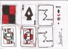
This is my 1st deck design. It's called the Straight deck.

I really like straight and neat lines, that's why I thought this would be a good concept if applied to a deck.

Do let me know what you think. I have attached the image also in case the link doesn't work. My deck can be viewed here: http://imageshack.us/photo/my-images/836/straightdeckwithjack.jpg/

Thanks.

-josea.
 

Attachments

  • Straight Deck with jack.jpg
    Straight Deck with jack.jpg
    187.7 KB · Views: 111
Jan 9, 2011
48
0
The concept looks nice enough, but an audience can't really judge a deck until there's real development in the design and detail. Yah it's a Catch 22 in that you can't get good feedback until you invest time in it, but you don't want to invest time in it unless you'll get a good response. But no one can really judge the enormous potential of a napkin sketch except the artist himself. I look forward to seeing more detailed images if you choose to pursue it!
 
Jan 11, 2011
150
0
ah yes. it seems I need to work on my drawing skills.

Thank you for your comments.

Just saying, I actually drew the designs on a sketching book before cutting all the design out and pasting on one sketch paper.
 
Nov 20, 2007
4,410
6
Sydney, Australia
I am just going to be brutally honest and say they don't look very good at all. I like that you are creative and trying.

The problem is, would-be artists haven't studied design, and designers haven't studied playing card design. An image that looks good doesn't necessarily mean that it would look good as a design. A design that looks good doesn't mean that it will look good when placed onto a playing card. Many people seem to confuse the three.
 
Gonna also have to say I don't like them either. I like the idea of being out of the box and being different than other playing cards. But to me this deck feels like it's caught between Tim Burton and his rugged look and a kids drawing. Please don't get me wrong I'm by all means not trying to insult your design! I just don't really feel into them, to me they look a tad too unprofessional, at least for me. I think the idea has potential, what I really don't like about them is that they look as though they were drawn in crayon, at least the faces, I like the rugged off kilter look of the backs, but the faces, pips, and court cards really need some work. That is really off putting to me.
But don't give up! Who knows what ideas may spur from this one!

@ReservoirRed: This deck has the similar 4 patches on the back like the Tetra deck but totally different concept, the Tetra deck is neon and clean cut and is used to provide different aesthetic displays when fanned, similar to the dragon display deck
 
Searching...
{[{ searchResultsCount }]} Results