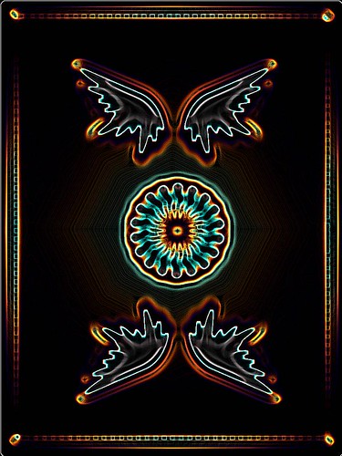
Back Designs

bentley

Elite Member
Nov 23, 2007
220
1
I like number 8 and the last two (They were the black and white cards). Number 8 is definately my favorite.
 
Sep 1, 2007
648
0
30
Canada
Sorry,

The design is great! It's simple, but it works perfectly for a deck of cards.

Now, I hate to be harsh, but this is the truth - simple Photoshop filters are not going to make your design any better. It's terribly obvious that all you have done is pressed a button and expected it to look cool. It's almost as if you've lost control over your original design. If I were you, I would use the design in the simplest form as possible - because that's when you can bring out the full potential of it!

Peace,

-Cory
 
Sep 2, 2007
89
0
I like 14 and 15. However, I think it would be really cool if you were to take 14 and 15 and draw angels in front of those wings and have them look up with their arms out or something like that. Have the torsos merge underneath the middle circle... that would be sick. Also, I agree with Cory Landels, that you shouldn't use photoshop filter.
 
Searching...
{[{ searchResultsCount }]} Results