Hey guys, I've be planning to work restaurants/bars, so I made my business card in Photoshop today ")

Tell me what you think! Criticism encouraged
Tell me what you think! Criticism encouraged
theory11 — Magic Tricks & the World's Finest Playing Cards
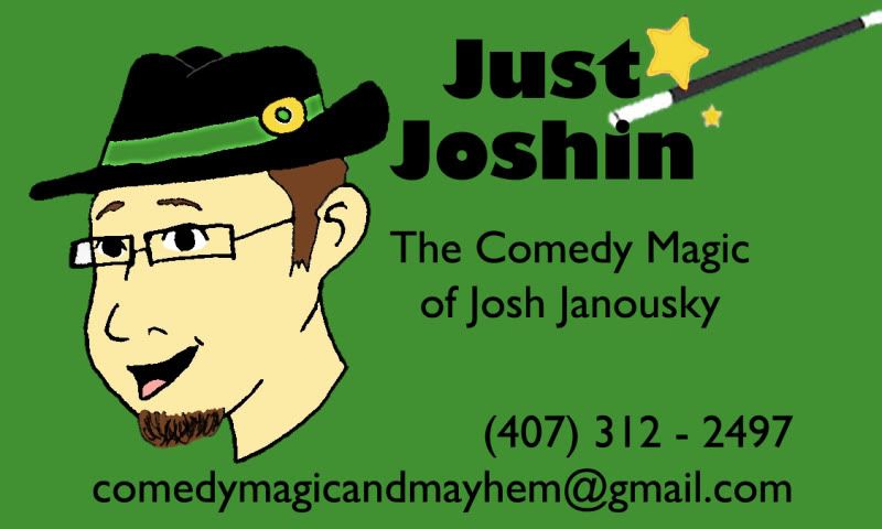
Hey guys, I've be planning to work restaurants/bars, so I made my business card in Photoshop today
Tell me what you think! Criticism encouraged
. Also it might be "customized" during tricks, so I think it's better not to keep it too busy.
Keep it simple. To be honest, and without meaning to offend, I did not like the other card that was posted here. Unprofessional email address, and a number of magical stereotypes.
Oh btw Lorem Ipsum is not my name but some not-so-random latin words used by designers as generic content, but I'm almost sure you knew that already since you're an architect
PS : Magicien is the french for Magician
)Another idea is to add some type of reveal on your card so that the spectator will want to hang on to your card because it was utilized in one of your effects.