Custom card design. Tell me what you think.

Do you like this card design?


  • Total voters
    32
(Just so ya all know I'll be changing the post constantly as the design gets better)

Kinda curious what would you think if I did a design in gold and put that behind the hearts? Also the poll kinda shows that the amount of people who like it are split in half. What do you think I could do to make the design better and more likable?

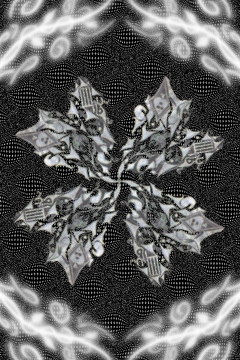
I think I've finally decided how I want my deck to look. I got rid of the jokers too I don't really like them. I still need to add borders though. Here's the two colors I like:


perfect+background.jpg


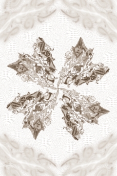
new whiteout (I just think it blends better):
new+whiteout.jpg


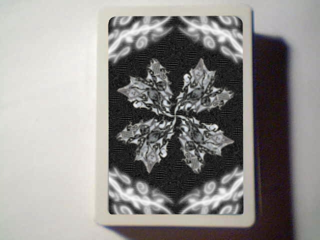
Here this probably isn't the best photoshop onto a card ever, but it works. Thanks to my studs for being the only deck that is ever always in my pocket :
photoshoped+dark+card.jpg


Here's my blog if you want to see all the different ideas I've been going through:
http://acuretomyboredom.blogspot.com/search/label/cards
or here now too:
http://designstocuremyboredom.blogspot.com/search/label/cards

Here's another simpler card if you guys don't like the intricate design it's a couple of rhinos:

rhino+card.jpg


Also quick question, suppose I went to bicycle and had them print me off their 10,000 deck deal or 100 decks or really just any deal (sorry I wasn't clear on this before). Would I be legally allowed to resell the cards?
 
Last edited by a moderator:
Jan 31, 2011
39
0
The way they are right now is wayyyyyy to plain. The design has no point. What is it supposed to be. Im not trying to be mean. But buying ten thousand decks n hopesto sell them and make a profit is not smart. Compared to theory 11 decks and even regular bicycle dedks this dezign is nothing
 
okay that's cool thanks for the input. I think it's really plain too I just kinda wanted to incorporate the heart design in the middle into a deck of cards, I know I did a poor job. I just can't figure out what the fudge I should do for the edges.... or like around the heart ya know?
 
Last edited by a moderator:
Dec 1, 2010
125
0
okay that's cool thanks for the input. I think it's really plain too I just kinda wanted to incorporate the hear design in the middle into a deck of cards, I know I did a poor job. I just can't figure out what the fudge I should do for the edges.... or like around the heart ya know?
I have been thinking to do a deck design. What did you to make the design? Did you use Photoshop? I also agree it's to plain.

Thanks!
 
I drew it on paper then scanned it then used paint.net. I changed the photo to show what I would in the card now instead of the card itself. I suppose that I could maybe just do another design in a different color around the heart.

The design has no point. What is it supposed to be.

It's just a heart with a bunch of random ideas drawn into it. I'm thinking maybe I should find some tutorials on how to edit photos cause it looked a lot better on paper, lol.

But buying ten thousand decks n hopesto sell them and make a profit is not smart. Compared to theory 11 decks and even regular bicycle dedks this dezign is nothing

I was just curious, I know I probably wont get this to be a hit design or anything, but I'm thinking that maybe if I buy like 100 decks or something a couple of my friends might be willing to buy them. Also, I'd have a ton of cards left over that I could use for my own.
 
Last edited by a moderator:

ATH

May 1, 2010
150
0
Don't listen to these guys. That's a pretty sweet design. I disagree with it being too plain; Wynns and Jerry's Nuggets are too hugely popular decks that come to mind with a very simplistic design. I really like how you incorporated the pips into the design as well. Great job bro!
 
Thanks ATH. I still think everyone is kinda right about it being open though, I'm thinking of doing 2 more design for the corners, but like make it a different object than a heart and do a plain shapes just to make the center design really stand out.
 
Feb 4, 2008
959
3
Good color choice and nice basic design. I agree that you need something to tie stuff up towards the edges but I like the basic design a lot.
 
Sep 3, 2007
24
0
What is the minimal order for custom decks, and how much does it cost? Even without knowing it is safe to assume 10000 will cost you a lot. You better have a brilliant design if you want to be selling them for profit, since you will essentially be competing with other card companies like theory 11 and so on.
 
I really like the design you have, but I do think the card needs to be filled out a bit more. You should definitely add a white border, that would fill up some space and help bring out the white design in the middle. Another thing you could do is duplicate the design and have one on the top of the card and one on the bottom of the card. You could also have one in each corner, but that might be a little too much.
 

tjf

May 23, 2009
30
0
Everyone saying that there's too much plain space obviously hasn't seen the coveted brown Wynn cards that sold out on here.. It's a great start, keep it up! ;)
 
Thanks for the info guys. I think I just had a brilliant idea on how to redo the design too. I'm thinking maybe I'll just go back to what it first looked like when it was sketched out on paper and have it look like that (maybe with inverted colors though), so that each card looks like it was hand drawn. I'll also add a white border and some kind of other design to fill the card up. Also if I do it how I first drew it it'll be a little sharper and more focused, cause for some reason when I was done editing this on the computer it was like twice as blurred as the original photo and missing some key parts, but I just said whatever and went with it. I think it's going to take me some time to get this right, but I think it's one of the better basic ideas I've had for a playing card.
 
Jul 13, 2009
1,372
0
33
Too Much open space! You are crazy if you think that anyone would buy those! That is a good start but put some geometric lines and shapes around it and post it again.

You sir do not Wynn...


I think the second one with the black background looks very cheesy and something that I'd probably find at a dollar store. The first one could look even better with gold or yellow outlining.
 
Feb 12, 2011
9
0
i like it.....simple but elegant.....and frankly the first one ant to bad...but it if you are going to add more...do way more......so then its complex and elegant
 
Searching...
{[{ searchResultsCount }]} Results