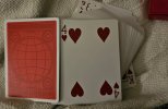
I dig the brighter backs, not so much the tuck box but that's not a big deal, but why make the backs a bright red while leaving the red suits a darker muted red? They matched well on V1 and now they just look bad against the brighter red backs. Is this a printing mistake or just don't care? Really makes no sense when it's such a stark contrast. I have 2 decks of V2 and they're both the drab, darker red against the bright red. Maybe it's nitpicky but I expect more from T11 since you guys are exceptional with details.