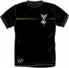
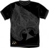
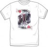
T-Shirts - Updated

Sep 14, 2007
45
0
Hey guys,

A few days ago, as some of you may remember, I posted up a t-shrit which I had designed in respect to theory11. Many people replied with great contructive criticism and I went back and re-did the shirt. :) Here is the new one, and a few more ideas.

Let me know what you think,
Thanks:D,
Shane.
 

Attachments

  • Theory11 Shirt.jpg
    Theory11 Shirt.jpg
    192.9 KB · Views: 172
  • Theory11 Shirt 3.jpg
    Theory11 Shirt 3.jpg
    48.6 KB · Views: 153
  • Theory 11 Shirt 4.jpg
    Theory 11 Shirt 4.jpg
    53.1 KB · Views: 234
Dec 4, 2007
1,074
2
www.thrallmind.com
Very nice!

I have to agree about the King of Hearts. It seems a bit bland.

It would be cool if ya put the spade in place of the angel as a new design. But thats just my opinion.

-ThrallMind
 
Sep 1, 2007
662
2
I like the first design - much beter with the fading on the yellow line and the logo off centre
 
Great improvements Trioxide. They look way better. Number 1 is a huge improvement. If I saw that in a store I'd be very excited.

I would probably wear number 2 and 3 as well. 3 is my kind of style, for some reason I looked at it and went meh, then when I saw it full sized I thought it looked rather cool.

Great job,
-RA69
-A69
 
Dec 17, 2007
1,291
2
31
Melbourne, Australia
I liked the first two, in fact I really want someone to make a shirt looking like either one of them.. THAT'S how good they are.

As for the third, it's not really my thing.
 
Aug 31, 2007
117
0
i really like the 1st and 2nd. the 3rd is good but not my style. i think if you get a "ONE t-shirt" deal the ace of spades should be on the back of the first t-shirt. however that wouldn't be my prefrence, it just seems like it would be too much.
 
Sep 1, 2007
586
0
Cornwall
remove the massive 11 logo and itll be worth buying...

instead of a big logo on the front which to me, looks hideous
put the t11 logo on the back near the upper neck, smaller...sorta like a tag
 
Sep 3, 2007
2,562
0
Europe
Kind of Hearts one is "meh", but the other two are awesome. You should give these ideas to Bayme and see what he thinks of them... I would buy one of 'em!
 

JoeCarr

Banned
Jan 6, 2008
664
0
Manchester
not my style, the designs are alrite, but i wouldnt wear one as it would just look like your trying to hard.... im not a big fan of magic comapny t shirt tbh.... i mean little 'livestrong' style bands would be as far as it'd go but it just seems so unbelieveable UNcool.... :) but the designs are 'aight
 
D

Deleted member 2755

Guest
I'd prefer for the 11 logo not to be there, but if it was I would still buy it. These look awesome! The first two are SICK! I would buy both :) As for the third one, I would probably buy it, but I'm not a huge fan. The first two though... those are awesome ;) J. Bayme.... sell these.....

-Doug
 
Searching...
{[{ searchResultsCount }]} Results