Another Playing Card Design

Sep 1, 2007
378
0
UK
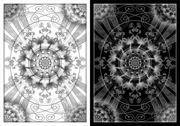
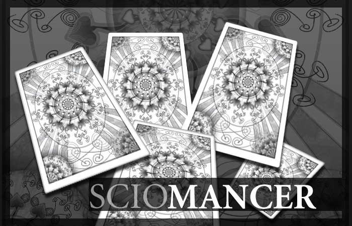
I haven't done one in a while, so I decided to do another card design. My last attempt at elegant ended up turning into a blood stained horror themed deck, so I thought I'd have another attempt at elegant. >_<

Please note that this has been done from scratch, no images copied from the internet.

altercastcards.png

altercastcardsdemo.png


Huruey
 
Last edited by a moderator:
D

Deleted member 2755

Guest
I love these cards so much that if they were released I would... I would... Argh, there is a video I wish I could post here, but I would get in trouble. :( (Think The Lonely Island. ;))

-Doug

-EDIT- In case some people didn't see that video and don't know what I mean... I mean that these cards are full of Wynn. (Yes, since we are talking about cards and I wanted to say win, I felt it would be better to say wynn because I'm cool like that and that's how I roll.)

Werd.
 
Oct 25, 2008
158
0
Michigan
Best non-professional card design i've seen yet. Leaps and bounds ahead of some of the other sketches i've seen on the forums....nice work.
 
Sep 1, 2007
378
0
UK
Thanks guys! Glad you like it :D

I do prefer the white myself. That's how I designed it. I inverted it as an afterthought.

I used Photoshop 7 to make this design.

In response to those suggesting I get some of these made, I've told myself many times that I get my own design printed, and I really would love to, but it's just a bit too difficult to do. I'd have to pay a fortune in shipping and customs, even for a relatively small batch. :(

Thanks for all the comments. :)

Huruey
 
Jan 21, 2008
21
0
Wow! Those back designs are awesome. I really want to see what the ace and the jokers would look like. Depending on what the ace and jokers looked like, I'd really be interested in buying these.

The only thing I can think of changing would be the circle of repetitive wiry patterns surrounding the circle of spades in the center. I'd just find a different pattern than what you used. That may just be my opinion, but I think that design should be changed.

Other than that though, I love it! Keep working on them.
 
Jul 26, 2008
470
0
NJ
I really like them, but here's some constructive criticism:

The one thing that doesn't seem to blend in is the corner design. It looks like you just cut and pasted part of the center. I think you should continue the same design that is outside of the center, and maybe put an image that is smaller and not cut off (like the quartered circles that are there now).

It was kind of hard to explain that, so tell me if you don't understand something.
 
Searching...
{[{ searchResultsCount }]} Results