Well none of you probably know me, But I created a deck of cards called steampunk playing cards ( not theory11s or lance millers ) I have launched my second deck of playing cards on kickstarter. I mainly want to know how to improve my deck to make it more appealing to potential backers.
Here is the link to the project.
http://www.kickstarter.com/projects/1762124010/ultra-ape-poker-playing-cards
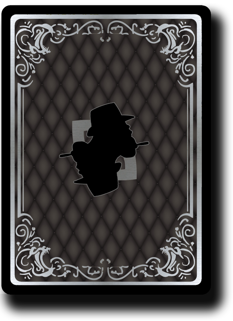
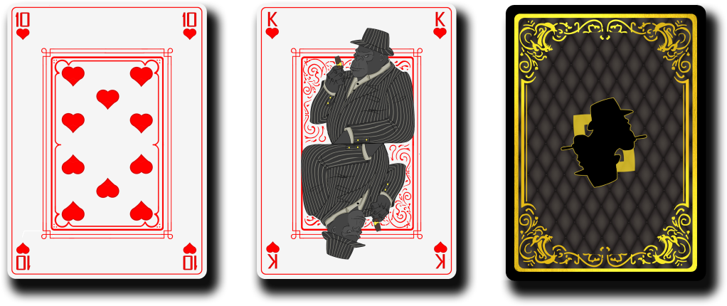
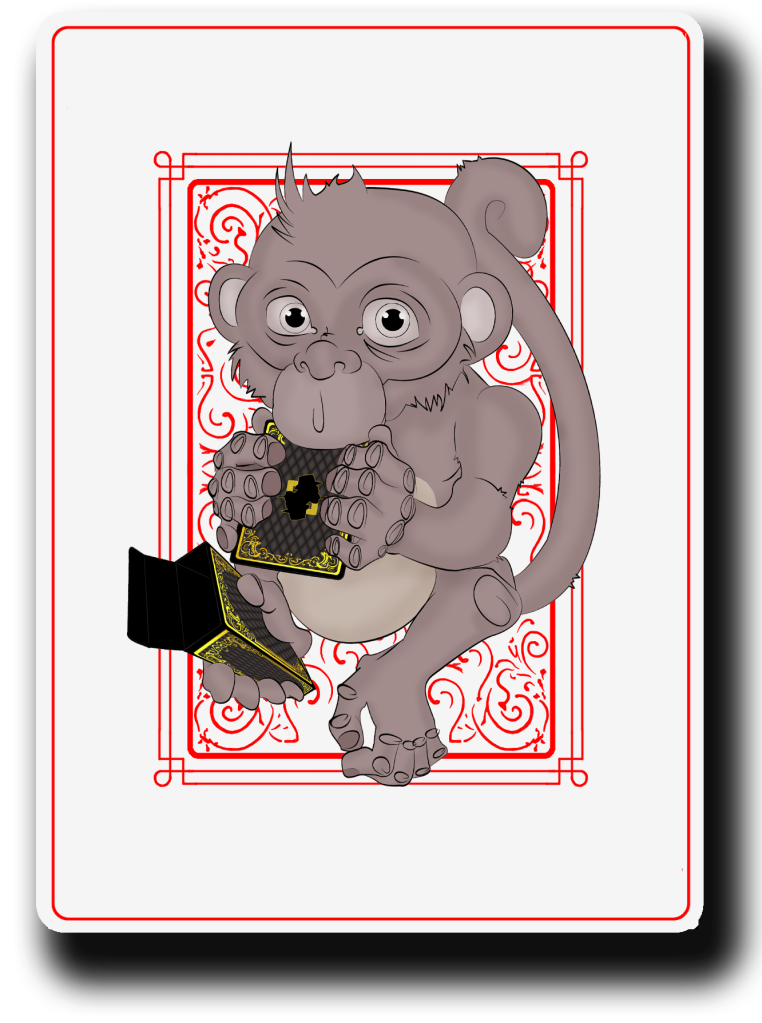
Here is the art.
Here is the link to the project.
http://www.kickstarter.com/projects/1762124010/ultra-ape-poker-playing-cards
Here is the art.