You are using an out of date browser. It may not display this or other websites correctly.
You should upgrade or use an alternative browser.
You should upgrade or use an alternative browser.
Business Card Feedback
- Thread starter Huruey
- Start date
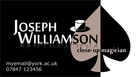
I actually like it a lot. What is the exact color on the left side of the spade? It looks a bit odd but I realize you need contrast to see the letters. Is it a gray? Very simplistic yet classy. Nice work.
Looks really slick.
One thing to look into, if you don;t have one, is a website. A lot of people will want to see your site and read what your about, and it's almost standard to have a web address on business cards.
As for the aesthetics, you nailed it.
One thing to look into, if you don;t have one, is a website. A lot of people will want to see your site and read what your about, and it's almost standard to have a web address on business cards.
As for the aesthetics, you nailed it.
Hey guys. It has recently become apparent that I am in need of a business card, and so I have put together this design. Any feedback would be appreciated. (Just so you know, I do usually wear a hat when performing)
Thanks,
Joe
I like it. A lot. It says everything it needs to, and doesn't go over board. The only suggestion I could give, all be it a minor one, is to include your website address on the card.
Well done!
I like it. A lot. It says everything it needs to, and doesn't go over board. The only suggestion I could give, all be it a minor one, is to include your website address on the card.
Well done!
Agreed with Draven. I'm not a top-hot kinda magician, but if you are, it fits. I love it.
L
I really like it. I would say to include your website. And maybe change the light side of the spade to a white. It looks kind weird.
J.
J.
Thanks guys.
Before I add my website, I'm going to need a website, so I guess I'll make that my next project. I used the light red/grey colour as an alternative to white because I felt just white looked too plain. I am probably going to change the hat to be a trilby hat to make it more accurate.
Joe
Before I add my website, I'm going to need a website, so I guess I'll make that my next project. I used the light red/grey colour as an alternative to white because I felt just white looked too plain. I am probably going to change the hat to be a trilby hat to make it more accurate.
Joe
Very simple, but beautiful. I personally think the hue on the left side of the Spade looks nice, but could be a tuned lighter a notch.
And might I suggest something else? Consider "hanging" your hat on the top of the letter "H"; I think it'll be a nice touch of uniqueness among the elegant layout of the whole card. Truth be told, I just like wearing my hat tilted.
Very nice.
And might I suggest something else? Consider "hanging" your hat on the top of the letter "H"; I think it'll be a nice touch of uniqueness among the elegant layout of the whole card. Truth be told, I just like wearing my hat tilted.
Very nice.
Really Nice!!
well...I don`t like my bussiness cards to have spades or something cards realted, but it`s because I don`t do only cards...but that`s my way...I really like yours!!!
well...I don`t like my bussiness cards to have spades or something cards realted, but it`s because I don`t do only cards...but that`s my way...I really like yours!!!
I like the contrasting color idea with the letters and the spade, but I think the hat graphic overdoes it a bit. I would take out the hat entirely.
"top hats" don't exactly shout "close up magician" either, which is why losing it could be good as well. However, I just think the card w/o it would be better.
"top hats" don't exactly shout "close up magician" either, which is why losing it could be good as well. However, I just think the card w/o it would be better.
I like the contrasting color idea with the letters and the spade, but I think the hat graphic overdoes it a bit. I would take out the hat entirely.
"top hats" don't exactly shout "close up magician" either, which is why losing it could be good as well. However, I just think the card w/o it would be better.
i would only suggest removing it if it was not the image he was going for. But he stated he wears a hat, so it fits.
Nice card btw
j