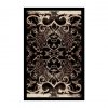
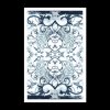
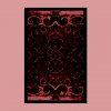
I like the white one, but maybe you should darken the lines a bit so they don't look so blue-ish...but the black one also looks cool. Argh I can't decide. The deck design itself has this kind fo dark and mysterious aura to it, so a colorfull...color...in my opinion, ruins the atmosphere.
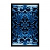
The second ones. (not different)
Don't darken the lines to black, maybe highlight some of the lines darker (the wings, some of the main scroll) but the reason it looks so awesome is the faded color, imho.
Sweet design. How long have you been working on it?