Dec 31, 2020
20
15


Hi EndersGame, very sorry for the late reply and thank you very much for your feedback.
The project has been on hold for almost a full year now, after having investigated many options to turn it into reality. I contacted a few playing cards companies and while some showed interest (or was it just kindness? 😅), they were too busy with other projects.
I then considered doing a Kickstarter campaign (thus the creation of this animation). I've contacted many suppliers, and while the financial risk was not too big, the paperwork and time investment for shipping and stuff worried me a bit. Plus I would have needed to decrease a bit the quality to make it affordable enough (like no gold stamping on the cover, or no seal sticker). And that's where I left the project...
... But it's not completely dead either, maybe one day I'll give it another try, and I'll make sure to post an update here :)
 
Dec 31, 2020
20
15
Weird, the integration of the Vimeo video doesn't work, and I can no longer edit my message... Here is the link without the https:/, otherwise it tries to integrate it and fails:
vimeo.com/511294112
 
Oct 4, 2022
79
21
Nyrow, you've done a fantastic job with these! I'm sorry to see that you've had trouble getting them printed. I wonder whether the playing card companies that showed some interest could be persuaded to put your project in the queue. I mean, perhaps they're too busy now, but if you tell them you're willing to wait and ask whether you can get in the queue, it might work. I really, truly hope you don't just abandon the project. It's just too good. I understand that the roadblocks you've encountered would be very frustrating. But perseverance is the key to success in most ventures.

I think the overall idea is brilliant, and your work on the faces and tuck boxes is simply sensational! I can't see why firms would turn this down. The cards are gorgeous enough that I think crowdfunding would work, although I think there's still slight room for improvement. I hope you don't mind some additional constructive criticism.

It may seem a bit late for comments and suggestions, but since it hasn't been printed yet, here goes: I particularly love the club-based hat and text homage on the tuck boxes, so much so that I think central image (hat and text) of the box would make a classier, much better AS design than the current orange tree ace. In fact, the tuck box cover's homage seems more important to me than the tree, and is so VERY attractive, that I would be far keener to buy the deck or put $ into crowd funding if that entire tuck box cover, in black, my fave by far (it is downright elegant), or in white, my distant 2nd fave, also served as the back of the cards. It would look far better IMO than the orange tree, and would repeat the homage on every card. The orange tree back, to me, isn't something special, although I understand you have your reasons. But it's a bit too obscure, unlike a top hat. That tuck box design is very special, and deserves more prominence, as the card backs. I wonder whether others here will agree.

There are other card decks, like Bicycle's Ninja, where IMO they should have used the tuck box design as the card back too. I mean, with that change, keeping the embossing, and keeping the gold where you use it, it would look SO classy IMO that it would even fit my image of what T11 might produce.

In minor details, as a positive, I would certainly not worry about the king's saw. It was for me an immediately obvious allusion, so it's perfect.

So my only constructive criticisms are that I think the card back would be vastly improved and classier using the tuck box cover instead, I don't think most would understand the orange tree reference, and I couldn't tell why the rabbit in the hat had an odd black peak above it for the AS. The rabbit in the hat are GREAT, but by themselves look rather like a club, especially with only the slightest modification (if the rabbit head is centered slightly more and *possibly* a tad larger; it would combine with the curved brim of the had as the three leaves, and the hat already has a neck then wider base, similar to a club (or ace).) I like that as a club far more than the orange tree. The black peak above the rabbit, which I think someone wrote is a handkerchief, isn't apparent to me as a handkerchief even after the suggestion is made, and to me distracts from the rabbit/hat, and looks...(sorry!) like a quite strained attempt to turn it into a spade. Furthermore, the hat has already been worked into a club symbol on the tuck box, so to do so for an ace (albeit with rabbit added) keeps that theme consistent and yet adds variety, with the change from hat to hat+rabbit being the trick; it is by far more strongly associated with magicians than a mysterious citrus tree, and so works better for buyers who've not been to see the exhibit you did or read as much of the history.

So I would suggest moving the rabbit/hat to the AC with the above-mentioned slight modification and no handkerchief, think of a new AS (I don't know magic history, but did you or others have any other ideas for the ace of spades?), change the card backs to elegant black matching the tuck box, keep it elegant, and get in line or crowd fund this rather than removing things to lower the cost. It's the elegance which attracts, and your extras are what make it so elegant. Also, there are importers who will import this kind of thing as a paid service, and with crowdfunding, you might have a higher budget to also be able to cover that one-time cost. So if one of your main obstacles is the hassle of the paperwork, that might be an option to explore.

I also wonder whether you would be willing to share more info (including where the shipping would be from and to; e.g. are the card companies in the US and you're overseas, and what country?), as there may be members here familiar with importation documentation -- I know one importer very well here in Taiwan whom I'm pretty sure I could convince to add your cases to their container and do the paperwork for a reasonable fee (were you living here), and so, similarly, another member might know one in your country who could help you -- also what size run is involved, as well as what your marketing channel(s) options are, as there are likely users who could give suggestions there.

With slight modification IMO this would be a true collector-quality deck; it's very, very close to that level, I think... it's just THAT good. As a final aside, if I had to choose between buying a deck with no seal and no gold stamping, it's a no-brainer. A seal is not that important except for performing magicians as 'proof' that a deck is new and not tampered with, and aftermarket seals are available. But I can't imagine a gold seal (or, my 2nd choice, black) costing that much extra. Heck, depending on the batch size, you might be able to find a batch of e.g. 1000 suitable gold seals or even custom order a batch and apply them yourself.
 
Oct 4, 2022
79
21
On 2nd thought, there's a way to make that rabbit in hat AS clearer and keep it as the AS... please see my PM.
 
Oct 4, 2022
79
21
Hi, Nyrow, I’ve sent you by email an idea for clarifying the handkerchief above the rabbit ace and adding an allusion to the magician. If you like it enough, it could replace the club on the tuck box, as an ace on the box is more traditional. That might also depend on which rendering looked better on the box when you finished the alternate design, of course, but an ace on the box is more classic in style.

I think clarity to the handkerchief is more important than the classic theme of keeping the ace icon all solid black. I like the way your idea also parallels and pays homage to the idea of conjuring and illusion -- conjuring one thing (a rabbit from a hat) -- which in the act, creates the illusion (through combination of an rabbit, hat and handkerchief to form an ace shape), rather than a real, traditional solid ace, and importantly, it keeps the magician included, albeit only his hand if my idea is used, as the one making the magic happen. (The handkerchief one king is holding above the hat and rabbit should also be clarified in shape to look more like a handkerchief, similar to the style in my emailed idea.) The same illusion of center ace artwork is already present for every ace, so it’s a wonderful, consistent theme.
The additional bonus to clarifying the ace rather than turning the rabbit head into one lobe of the club is that you can keep the orange tree club (which is nicely designed enough; at first, it felt too obscure to me, but that was out of my own ignorance, and after reading descriptions of his history (which your deck inspired me to do) and the trick, I now realize why you want to keep it and even give it prominence, and I totally agree. I now understand why you even chose it for the card backs, which do also mirror the two Bicycle circles, as you say, and really match the classical style of the card faces more than my idea of a black back matching the tuck box, although I still personally strongly prefer the black back idea (matching the tuck box) much more, as being particularly elegant, which is, again, something which he personally brought to the art of magic, taking magic from the streets amidst the riff raff, to an elaborate theater, dressed in coattails, and with the top hat, and the color black, synonymous with elegance in the formal wear of those times. And you’d still have the orange tree ace. But that is of course your call. Either way works well, with orange tree backs mirroring the classic playing card style, which goes well with the classic faces, or a black tuckbox-like back, being unique and elegant.
You could combine the two ideas, making the card backs black, as you mentioned to me, for elegance, yet retaining the orange trees on it. By the way, the son being levitated is your best idea yet for a card-back corner, and the clock in the center is perfect. The orange trees (is that what they are?) on the sides of the back don’t work for me, but there are plenty of options, like two or three inter-meshed gears, alluding to both his watchsmith background and mechanical devices.
As to worrying about black cardboard and yet getting both white and gold foil on the box, you could use white stock, print black on all but the parts in white, and then only add foil. The seal would not have to be custom-made. But custom stickers shouldn’t be expensive, especially not if sourced through Taiwan. If you have any trouble communicating with suppliers here, please let me know. I’m fluent in Mandarin and although I'm working full time and also homeschooling, I might be able to be of some limited assistance; I could help check your Google translations from French to Mandarin, if needed, as you know how bad those can be.
Any symbol on a seal alluding to him like a wrist watch, butterfly, top hat, rabbit in top hat etc. would be lovely. In gold for the black tuck box.
 
Oct 4, 2022
79
21
My apologies for the back-to-back posting, but I have more ideas to share, and there's a word limit on posts.

As you say, often only the ace of spades is customized, but there’s so much to work with, in terms of magic history, but particularly after I’ve now read up slightly on Robert-Houdin’s life, and I think your four customized aces is clearly the best idea. Certainly just two being customized seems odd. And in my opinion, the more customization the better, as it’s what makes the deck special.
The curtains for the AD are great! It’s very clear that they form a diamond, don’t worry, although it’s a trivial matter to take the left side and mirror image it on the right for perfect symmetry. In addition, having things that *appear* to form the ace shapes, rather than just *being* traditional, enlarged and elaborated suit pips, the curtains again echo the ideas of conjuring and of illusion, as you are conjuring the shapes from something else (curtains; cards; a kerchief, rabbit and hat; an orange tree), and the curtains in particular, with the stage, would give you room for the option, should you choose it, of placing at its center an allusion to one of his most famous tricks. Since his sons were so prominent in his acts, and the tiny son being levitated in the card back corners is not prominent (although good), and yet it deserves more prominence, you could actually put Robert-Houdin levitating his son there, or just the son levitating on one stick (I prefer the former, if it fits), or a son could be blindfolded, sitting in a chair on the stage, as in their secret communication act, although the allusion to the blindfold can be elsewhere, as on one of the jokers or face cards, making the levitation act the best candidate for the stage.
*Definitely* keep the French for the names below the famous tricks; it would be balanced if such names appeared only below the aces and jokers, and nothing else. You are French, no? And French is an integral part of Robert-Houdin’s name and history, having even performed before the French king, and the language is elegant (keeping that theme running); furthermore, some of the French words are familiar enough (le chapeau), and some of us will even get a glimpse of etymological connections to the ones like le lapin that aren’t, if they know the word leporine, or taxonomy (the genus Leporidae), Italian (as in the unfortunate labbro leporino) or Spanish (leporino, labio leporino, liebre) etc.
I particularly like your idea of adding text below the tree naming the trick; I suggest using it with his full name, Jean Eugène Robert-Houdin's Marvelous Orange Tree, perhaps with a line break between his name and the trick's. I suggest adding his given names so that those less informed don't mistake Robert for his given name, but it's totally up to you of course. I like your info card with his portrait, and cannot read the tiny text below it in your image, but again suggest his full name, and that you be sure to add e.g. "Widely known as the father of modern magic" (or "...of modern conjuring") and perhaps his BOB and BOD. Again, just an idea.
Another idea is to add more numerous allusions throughout the deck, at least to the face cards and jokers, e.g., subtly and small, behind the stem of the orange tree, to add two small butterflies, one on either side, each holding the tip of a handkerchief, which drapes behind them and behind the tree's trunk, as they formed an amazing part of that act. And/or a clock (or egg!) in the center of the tree’s base pot. Just an Easter egg (here, literally) for hunters to find. And finally, rather than only generic magical items like saws and wands (which are good), if there is any way to include more references to him somewhere, such as a bit of clockwork mechanics, like a face card that is slightly modified to suggest an automaton writing something (while remaining classical in style, e.g. changing an elbow joint and/or wrist joint to a pair of intermeshed gears), etc.
The three cups is a nice historical link given the engraving and story you shared, and a joker performing it is nice, even a classical joker as you have them, but I’d prefer a non-skull face unless there’s a historical connection between him and a skull. I’ve personally always preferred there to be *some* difference between the two jokers. One could be in color. Or blindfolded. Or both could raise one cup, but different cups, and/or with something different under each cup – an egg (a bit subtle of an allusion, I know), an orange, a gear, a dove just starting to take flight or sitting there, etc. Or, as in the engraving of young Jean-Eugène Robert (without the Houdin, of course, at that age), have one ball atop one cup for one Joker, and the other lifting a cup to reveal an orange or egg or butterfly. Or two cups, revealing both, as they were connected in his orange tree trick. Or several of the above ideas at once. Another Easter egg: the far right and left center edges of the back, at the ends of the horizontal bar, could be butterflies, just outlines to match the rest of the scrolling better.
If you lack four ideas for any of the face cards (I think you said you needed another for a queen), one could be an allusion to the automatons, given their importance, especially the one that wrote and drew. While retaining a classic style, a queen, if you lacked an idea, could have instead of an elbow joint and/or wrist joint, a pair of engaged gears, and be drawing upon on a pad, with the drawing being another allusion – a bit of clockwork etc., a rabbit, the orange tree, etc.
One stronger constructive criticism: I don’t think the cards in a circle look enough like a heart for the ace. It's not just the bottom part that isn't clear; the top is also not symmetrical enough and the hand not rounded enough. That could easily be reworked with symmetry, two hands, each fanning a semicircle of cards, for the top of the heart (far clearer), and the cuffs (with tiny heart-shaped cufflinks and the end of an elegant black sleeve). You might be able to work it so that the corners of the cuffs could touch to form the bottom point of the heart; I was going to sketch it for you but am also busy as père Noël. Again, the combination of other things forming the heart, giving the illusion of a heart, fits the themes of the aces and the art.
A tiny additional allusion to the man and Easter egg would be a wristwatch on the wrist of the hand holding the kerchief above the rabbit/hat ace.
Another detail: you have tiny symbols on the crowns/hats of the royalty but they could be replaced with the suit pip for that particular card. Other than classic style, why have what look like clubs on the crown of the queens and kings of spades and hearts, after all, when that trim could easily be changed to tiny diamonds, clubs, hearts and spades. The classic style would remain, given how subtle the change would be, and yet it would be one more little Easter egg to hide, which could become one of the marvels of this deck – nearly endless Easter eggs.
If you lack ideas for the kings, or decide to move the cage to another card in case you lack an idea for a queen (the king with a cage is nice, but it could as easily be a queen with one, or even a jack, for reasons I explain below), then one idea is to have that king then have some symbols representing King Louis Philippe I, who did rent the theater for a private performance by Robert-Houdin, after all. A glance at a portrait of the king on Wiki, with epaulets and medallions, and/or at his coat of arms should give you ideas on how to link a king more to him. His crown could be restyled slightly to more resemble Philippe I’s, he could hold the orb-topped scepter with the cross, have a bit of ermine fur, the same medallion as at the base of his coat of arms, and/or a fleur-de-lis could be incorporated somewhere – on him, or in the card backs. he could hold a clock or large pocket watch, if needed. Or you could keep each king with your magical object of choice, but give each epaulets and change the symbol at the chest’s top center to a fleur-de-lis or one of his medallions. The one losing the cage to a son/jack could then hold the magical wand, but it could take the form of the orb-topped scepter with the cross from Phillippe I’s coat of arms.
 
Oct 4, 2022
79
21
(Sorry for the length of this, but my mind is always just a stream of ideas) I would also suggest putting allusions to his sons' very central involvement in his shows in the four jacks, jacks being son-like. Since one emerged from a birdcage being pulled from a drawing portfolio, the birdcage fits better on one son/jack, another could be blindfolded as per the earlier-mentioned allusion, one could hold the light and heavy chest (even though in his show it was a child spectator), and perhaps a little more research could uncover one more trick in which a son helped, or he could be the drawing automaton if you’ve already got all your queens and kings covered.

I particularly like your idea of adding text below the tree naming the trick, or better yet, Jean Eugène Robert-Houdin's Marvelous Orange Tree, perhaps with a line break between his name and the trick's. I suggest adding his given names so that those less informed don't mistake Robert for his given name, but it's totally up to you of course. I like your info card with his portrait, and cannot read the tiny text below it in your image, but again suggest his full name, and that you be sure to add e.g. "Widely known as the father of modern magic" (or "...of modern conjuring") and perhaps his BOB and BOD. Again, just an idea. If you want to give that portrait a normal back you could, but perhaps one card with a fuller summary of his history and significance would be appropriate. Either or both could be blank backs. I really REALLY like it when decks include a pair of normal-faced blank backs, a double back or two, and a normal back with blank face or two. It adds a lot of value for the magician to do tricks while using cards consistent with the rest of the deck. Finally, it could be boxed in Si Stebbin’s order with a card showing that order’s set up, as an additional bonus. Si Stebbins is the easiest system for me, and a classic. If that cost too much to have them put in order at the factory, just including a Stebbins order card in case a buyer wanted to reorder them would be a lovely touch, e.g. with a chart on one side like Wiki has, and on the other simple instructions on an easy way to put them in that order, e.g.
1. Sort the 13 cards of each suit face up, ace 2, 3...Q,K with the ace worth 1, J11, Q12 and K13. Place the stacks in order
left to right in CHaSeD order: club heart spade diamond.
2. Cut the heaps so the top cards are AC, 4H, 7S, 10D, rotating the other half of each stack to its bottom.
3. Build the whole deck face up by taking one from each stack, in order left to right,
counting as you go (ACE two three FOUR five six SEVEN...). Bottom up (face up) it will be AC, 4H, 7S, 10D,
KC, 3H, 6S, 9D, QC etc. When you flip the stack face down it will be in Si Stebbins order.
[I haven't double checked that but I think it's how it's done.]
A very minor idea is to change the tip of the magic wand for one jack to be more like a modern one, straight, dark, with a white tip, as I didn’t immediately recognize it as a wand and yours runs off and is cut off by the border line as it is. Or to give it to the king, as I noted; or to give it to the king and make it King Phillip I’s actual orb-scepter, which also closely resembles a magic wand (at least as much as the current jack’s does).
If for any reason you don’t or can’t incorporate any classic engravings or your own drawings of his most famous tricks, it would be lovely to include them on to three extra cards, like gaff cards. One could have a normal back, one could be double-faced with two different trick scenes, one could have a blank back, and so on. A few extra cards will still fit in a tuck box, although you’d want a sample box from the factory to test how many fit. And if they don’t fit, I personally think that adding a small black, envelope for cards (I buy them online here, for packet tricks, so I know they’re available) and including each of the above additional cards would be a fantastic extra for the deck. It would be worth an extra two euros and presumably cost less than that. Far too many custom decks don’t have any gaffs added, perhaps just a miserly blank and/or double back. A deck for magicians in particular, as this is the audience this deck will appeal to most, should have a good handful more. (Ok, Kent the Koncise will shut up already, LOL.)
 
Dec 31, 2020
20
15
Hi Kent,
Again, thank you so much for your feedback and advise. I'm glad to read that you also admire the beauty of the orange tree trick and therefore understand the choice to highlight it into an ace. It is really impressive that you learnt so much about Robert-Houdin and it makes your feedback even more relevant to me. So let me try to continue the discussion for each topic:
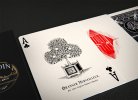
Ace of Spades:
It's funny how we came to the same thoughts: I had already attempted to add the magician's hand holding the handkerchief but without finding a satisfying solution to integrate the hand in the spades' shape. Having said that, I gave it another try, while also decreasing the contrast and lowering the brightness of the rabbit to make it merge better with the hat and handkerchief, so that the Spades shape comes better, without the need of adding a background (see my profile picture). I also shifted the rabbit to the left to increase the volume and better follow the shape of the ace. Finally, I added shiny reflections on the hat to make it visually slimmer, and thus more like the Spades base. This was a quick photoshop edit, so it would need more work, but I guess enough to evaluate whether the changes are worth it.

AceSpadesEngraving.jpg


Back of cards:
You're now the second member to mention preferring the black backs. Aside from the aesthetic preference, I reckon that the back of the cards usually match with the back of the tuck box. So following this rule, this is a big argument for black backs. What you noticed on the left and right are actually the legs of the table on which lays the Orange tree. It's rather abstract indeed, but I thought it fit quite well to give structure to the card and introduce the "frame" with the floral flourishes (which also need some work by the way!)
black back

And you mention the using "two or three inter-meshed gears, alluding to both his watchsmith background and mechanical devices." and guess what... that's also what I considered (although only tried it for the front tuck cover background, see next picture). I really like this subtle idea, and I see aesthetic potential to use them as a pattern.

Tuck_design_withGears.jpg


Tuck box:
"As to worrying about black cardboard and yet getting both white and gold foil on the box, you could use white stock, print black on all but the parts in white, and then only add foil. The seal would not have to be custom-made. But custom stickers shouldn’t be expensive, especially not if sourced through Taiwan."
Yes, I'm also considering doing this, but this leaves white borders of the cardboard, but probably worth indeed. Let's see when I get back to the numbers...

Seal:
This was a draft for the seal... now that I look at it again, it kind of looks like a stamp. What do you think about it? I like the red though, but a gold one could make the link to the gold highlight on the front a bit better, I should try that! And the picture is taken from one of Robert-Houdin's spectacle flyers, but a more abstract picture like you suggested could also work very well.
SealRendering.0.jpg


Ace of diamond:
Yet again a great piece of advice, I could include one of his acts in the center of the curtains. I keep that in mind!

Text below aces:
French it is then :)
And I tend to think that only the Ace of Clubs should have text on it. It makes this card a bit more special, which justifies more the ace of Club on the tuck box... and I wouldn't know what to write below the other Aces.
Something like this:
"L'oranger merveilleux,
par Jean-Eugène Robert-Houdin"

Jokers
Noted, although considering how much time it took me to draw it, I'm tempted to keep it simple and just mirror it... Ok that's lazy, but this way he lifts the opposite cup. Simple but with at least a small twist"

Remaining ideas for faces:
Thanks, I really like the "elbow joint and/or wrist joint, a pair of engaged gears, and be drawing upon on a pad". Will apply it to one of the queens (Diamond, Heart, or Spades). I also really want to include the coin magic in one of them, but struggle to find how. Any tips?

Ace of Heart:
"One stronger constructive criticism: I don’t think the cards in a circle look enough like a heart for the ace. It's not just the bottom part that isn't clear; the top is also not symmetrical enough and the hand not rounded enough. That could easily be reworked with symmetry, two hands, each fanning a semicircle of cards, for the top of the heart (far clearer), and the cuffs (with tiny heart-shaped cufflinks and the end of an elegant black sleeve). You might be able to work it so that the corners of the cuffs could touch to form the bottom point of the heart; I was going to sketch it for you but am also busy as père Noël"
Hm, noted, but I remember having really struggled already on that one, and although the sketching is still a draft, the shape was really the best I could come up with, without making the hands absolutely unrealistic. So don't rush it, after all, I took 2 years to update this thread, but I'm curious to see your sketch indeed.

Court cards:
"Other than classic style, why have what look like clubs on the crown of the queens and kings of spades and hearts, after all, when that trim could easily be changed to tiny diamonds, clubs, hearts and spades. The classic style would remain, given how subtle the change would be, and yet it would be one more little Easter egg to hide, which could become one of the marvels of this deck – nearly endless Easter eggs." You summarized very well the intention of that deck haha! Let's add this modification to the list!
Very interesting ideas regarding the Jack as Robert-Houdin's son. I should also spend some time on that.

Added gaffs
"Far too many custom decks don’t have any gaffs added, perhaps just a miserly blank and/or double back. A deck for magicians in particular, as this is the audience this deck will appeal to most, should have a good handful more."
I agree very much. So far indeed only planned to add Robert-Houdin's portrait and quote, but adding a bunch of gaff cards could really fit this deck and I also imagine having it as an option would be the best. Such a great advice, I will also check how it works with the numbers.

You wrote so much that I forgot a few points, but I still have it in mind :)
Looking forward to update this thread with new development!
 
Oct 4, 2022
79
21
Hi, it’s been a crazy week, so I’ve only just now had time to look at this. I can only answer part now; more later.

Only AS having text: I think you’re right. But the orange tree trick’s title, or even a description of the trick, could be on an advert-like card, with a quick bio/homage to the man on the other. The flipped jokers, thus each raising a different cup, is a nice distinction, yes. You could even have the ball present in one and absent in the other, or change the balls to be references to his acts, like an egg, an orange, a butterfly. Or not...

AS redesign: I like it with the hand above it better, like your sketch on the left. The hand is subtle, helps support the idea of the handkerchief and clarify what it is, and strengthens the card IMO, even though it is nontraditional to have more than just the spade itself on an ace card. But I don’t think you should be limited by tradition (Houdin wasn’t!). It brings the magician into the act, even though subtly. Without it, your handkerchief still doesn’t look like one to me (I wonder what others here think on that point). If you blended yours with the rolling over edge like the one in mine so it looked more like cloth, it might work well! I do like your shifting of the rabbit leftward in the left image much better. It fills out the spade shape far better. And I really do prefer keeping the hand. In the end, though, it’s your design, so you’ll make the calls, of course.

You're right about the AH in that it might be hard to get the hands to cooperate... unless they joined at the wrist, truncated to a point like a heart's bottom, so imagine (and even try for real) a fan with each hand, with your wrists (or rather the base of the palm all the way to the pinky-side edge) touching. Your hands naturally already start to form a heart that way, heart ace.jpgand the round fans simply complete the top. Here's just a quick screencap of clipart from the web, rotated, mirrored and truncated for the VERY roughest idea; it still needs limiting the outer cards near the hands, changing the hand angles and extending them down to form a more perfect heart.The cards could be faces or backs, e.g. the most prominent card in the center could be the face of your heart ace, a magical item, Houdin, etc., but the redder the better, for a red heart, like a red version of your current orange tree back design.
I’ll have to leave it there for now; hopefully more soon.
 
Oct 4, 2022
79
21
Ah, now I see the table and legs for the orange tree. Once explained, it makes sense, sure!

I like the gold seal much better. It’s quite different than other seals, and is reminiscent of a stamp, but a stamp commemorating Houdin, which I think is perfect, and unique is good!

Gears in the background for the tuck cover aren’t a bad idea but due to the texture of the hat they cause the edges of the hat to not stand out clearly enough, I think.

On English and capitalization, since years is in an adjective position, I’d drop the final ‘s’, and wince it’s in title case, that word should also start with a capital: 150 Year Anniversary.

“Yes, I'm also considering doing this, but this leaves white borders of the cardboard, but probably worth indeed. Let's see when I get back to the numbers...”

I see what you mean. Perfect all black looks nicer, but if you need to go with white cardboard for cost, it will still look very good, as your design is very classy. It definitely looks like something only a skilled graphic designer could create.

“Thanks, I really like the "elbow joint and/or wrist joint, a pair of engaged gears, and be drawing upon on a pad". Will apply it to one of the queens (Diamond, Heart, or Spades). I also really want to include the coin magic in one of them, but struggle to find how. Any tips?”

I don’t know coin magic well enough to know what possibilities there are, but each hand open, one (the higher one) with a coin (slightly oversized and golden/yellow of whatever shade is already used on the faces) and no coin on the other palm would be a start, implying ‘now you see it, now you don’t.’

“adding a bunch of gaff cards could really fit this deck and I also imagine having it as an option would be the best. Such a great advice, I will also check how it works with the numbers.”

You’d want to check how many the tuck box can hold, too…e.g. would it have to be slightly thicker to hold more than 2-3 extra, and would that cost more? If a custom tuck box thickness would add too much to the cost, a separate packet (envelope) in gloss or matte black could accompany the deck. By way of example they sell them here, e.g. at an overpriced $5NT (about six envelopes per USD) singly, and they hold about 15 cards without getting too snug; I’m sure they’d be much cheaper in bulk.https://shopee.tw/【天天魔法】【B236】信封(可放Bicycle單車牌大小)(當預言用的信封)-i.827072.510101125
 
Dec 31, 2020
20
15
Hi there, as always, thank you so much for the advice. I will reply to you when working on each of the points you mentioned to see if and how I implement all those ideas. I've achieved quite a milestone now for the back of the cards: "vectorisation". So far, the designs were made in a bitmap file format (except court cards), which is not ideal for printing and can look a bit messy. So some designs need to be created again in another software, and although very time consuming, the result looks indeed cleaner in my opinion. I took the opportunity to add a few more Easter eggs, among which some gears in reference to his background and automates.


close-up_vectorisedBack_smaller.jpg
 
Dec 31, 2020
20
15
Hi everyone,

Small update this weekend with the rework of the Ace of Diamond with the engraving style, and integrating the son of Robert-Houdin performing a levitation trick based on your advice Kent :)
It brings a bit more details and interest, so I'm quite happy about that!


close-up_AceOfDiamond_SD.jpg
 
  • Like
Reactions: Dragonbones
Oct 4, 2022
79
21
Perfect! The way you've done it result in better symmetry and clarity than one of the other ideas, which was to have Houdin next to him performing the act. In retrospect, that would have been crowded, too. I really like it the way it is now!
 

Aristotilean

Elite Member
Dec 6, 2018
136
150
These cards have come such a long way. I love the newest back design, the change from red to black was especially tactful. In general, everything is better proportioned and it fills the space perfectly.

When you say that some card companies are interested, do you mean that you are primarily interested in licensing the design? If not, you should be able to just do a custom order with Bicycle or Cartamundi. Most people I know who have created custom decks just use Kickstarter or another such platform to gauge interest and then do a 1000+ order run. It’s expensive, but most custom designed decks from individual designers are.

The problem you are likely running into with licensing is that the design is too similar to traditional decks (especially when it was in red). You are clever in how you incorporated easter eggs into a heavily classical design, but this will mean that the deck won’t stand out as much from the perspective of the card companies. They are looking for skews that will attact either a new base or a broad base, and typically homages to classical decks don’t sell as well, unless they are completely gimmicked (like a marked deck).

That’s not to say that some company won’t pick it up, but it is to say that you might be better off showing proof of concept via an initial (and perhaps even limited) Kickstarter run.
 
Dec 31, 2020
20
15
Thank you both! I will try to work with an actual illustrator to rework the ace of Clubs and Spades, let's see how it turns out...
Indeed, I'm primarily interested in licensing the design, because I don't see myself doing another deck afterwards, and because the risk is not null. Having said that, I really want high quality cards so if no existing playing card editor is interested, my goal is still to explore Kickstarter indeed. Now the problem is that the cost is really high, so the threshold to reach would follow too (more than 10k). And doing more than 10k means a lot of backers, despite the average on Kickstarter that seems to be around 300 decks being sold. I also don't have much media to communicate the campaign on. So I still need to think about that. One way could be to send some early drafts to be reviewed (I'm thinking about you Magic Orthodoxy!)
But one thing at a time, there is still a lot to fine tune before wondering about those questions :)
 
Dec 31, 2020
20
15
Worked with another artist to redo the main two cards, Ace of Clubs and soon the Ace of Spades. Really happy about the result, it almost looks like a figure Robert-Houdin could have had in his notebook :)
In the meantime, I am still trying to clean the Ace of Heart
 

Attachments

  • close-up_AceOfClubs_SD.jpg
    close-up_AceOfClubs_SD.jpg
    890 KB · Views: 117
Searching...
{[{ searchResultsCount }]} Results