Smoke & Mirrors : A Cordial Invitation :: Friday, Aug. 1

Mar 16, 2008
183
0
Melbz
I was thinking about the possible reasons for having the D's. Ego, that's all I can think it is. why the hell else would you put your own initials SO big on a deck of cards? cause you have a big fat head.

"look, look at MY cards, look here, see? those are mine and my brothers initials!"

why else?

"cause they look good when you finger spin them", big deal.

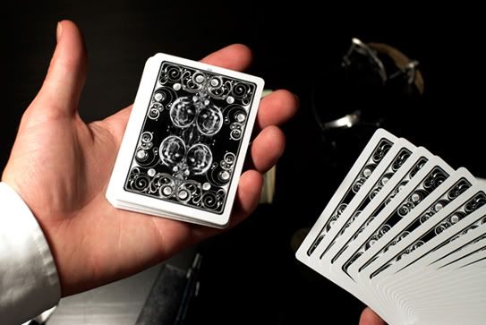
I'm not bothered about how they feel. there are many decks out there that feel great, eg. plain old bikes. they need to redesign these cards. just get rid of the ridiculously stupid double D's. I was looking forward to having a new style of card but not anymore. I like the bucks, but my opinion of them just took a vicious bashing.

oh yeah the court cards look like crap, they must really love yellow

Well said.
 
Nov 20, 2007
4,410
6
Sydney, Australia
I'm sorry, did I hear the words "Too High class"? I'll show you what "Too High Class" is in a few days ( and it won't be a photo of a jerry's nugget), I thought theory 11's goal was to shatter a perception that was once held on laymen about magicians, that they have top hats, tails, gloves and canes, would you want to be somebody like that? When your friends ask you to do a trick do you say: "Oh sorry, let me get my hat and gloves, give me about fifteen minutes.

lol that's rubbish, if you think that's "high class", then yes, the deck clearly is too high class for you. Sophistication in elegance.
 
Mar 29, 2008
139
0
ok guys
idk if any of you check thecuso's blog, but i wanted to get my two cents in. if you go to www.thecuso.info RIGHT NOW and see alejandro's thoughts on the decks, then scroll down to where he posted scott and seans photoshopped decks. THOSE decks are absolutely beautiful. THOSE decks are what i wanted out of smoke and mirrors

just my thoughts
link: http://www.thecuso.info/2008/08/smoke-and-mirrors-what-they-could-have-been.html

cheers,
cms


These pics?


SmokeandMirrors.jpg


SmokeandMirrors2.jpg
 
Last edited by a moderator:

sinjin7

Elite Member
Apr 19, 2008
33
0
.... I guess these cards are too high class for you guys. These cards are perfect for the working magician. You wear your suit, your watch, and you have these cards. Although if your a teen at home these aren't your type of cards.... YOu guys are coming up with excuses to attack the deck.... So if you like the deck then buy it. If you don't then don't buy it.

Edit: one more thing. When you guys say you want something new and unique this is the deck. Basically what you guys really mean is that you want the same old design, and nothing different except maybe a few more lines and dots.

I don't think people here are looking for an excuse to attack the cards. I personally REALLY wanted these cards to be as kick ass as they were hyped to be. Seriously. Almost everyone here totally respects the Buck twins and we believed they would totally deliver. From a visual point of view (that's all we can have for now since none of us actually have the cards yet), they were ALMOST great, its just that all the "D"s are unfortunate. Since I ordered these cards anyways, I hope the feel, finish, and handling of these cards compensate for the notorious double "D"s on the back of every card...
 
Sep 3, 2007
1,231
0
I was thinking about the possible reasons for having the D's. Ego, that's all I can think it is. why the hell else would you put your own initials SO big on a deck of cards? cause you have a big fat head.

How about advertising? We live in a society of Fan-boys that wouldn't think twice about saying go to ....com to get these cards. Much like having an ellusionist advertisement card in the deck and forcing it at the end of a routine. I wonder though why ellusionist has never created a deck with E's all over it. It might have come up but I'm sure people shook their heads.
 
I was incredibly psyched for these cards, but they were a serious letdown.

The backs are stylish, barring the D.

And, as far as "high class" and "sophistication" goes, that image is completely shattered by the ugly court cards. They're absolutely hideous. I can't see myself wanting to perform with those.

The Ace of Spades is absolutely gorgeous. The Jokers are fantastic, even though the D is a little irritating. But the court cards, and the simplicity of the back (the D in particular. It even would have been better if they had just used the DD logo) kind of break the deal for me. I might still get a pack or two, but they aren't really that high on my list anymore.

If you're going to use a fantastic artist like Mr. Scott, showcase his talents in two plces. First, the Ace of Spades, which they did, and second, and more importantly, the backs. It's what the audience will be seeing ninty percent of the time, so don't leave them in the dust.

And if you aren't going to design elaborate, sexy court cards, use the stock ones.
 
This will be the first time I chime in on these cards. I really love the back designs. I am not crazy about the logo in the center but it doesn't bother me. My favorite part of this deck though, despite popular opinion, is the court cards. I love how simple they look.

I just ordered 3 of each and I personally can't wait.
 
Nov 20, 2007
4,410
6
Sydney, Australia
Alright Sire, I'd like to know what you were expecting of the Legendary Smoke and Mirrors?

Two decks of cards which have uniqueness of character beyond any other deck of cards; not Rider Backs, not based on anything else, a design that is elegant. Not particularly classic but something arty, reminiscent of the sophistication one might find at a Lounge Suit-dress code function, brought to reality by the artist. Someone else mentioned the Gucci of fashion, the Bang and Olufsen of furniture, this was what I expected of Smoke and Mirrors, a "luxury" design deck. With the expected feel of the Aristocrat stock.

I don't expect many people by personality to be able to pull it off; this is not a good thing or a bad thing or any reflection whatsoever, it is simply how it is, in my opinion. Just as Armani sunglasses don't belong on everyone, not because they don't deserve it, but because they can't pull off that style, which is different from Gucci's style or any other designer.

I've gotten what I expected, stock/feel to be decided, and I'm happy.

Peace
 
Although I was a little disappointed with these cards, they're still not that bad. I mean they could have got rid of the Double D's and replaced them with something like that picture on thecusos blog. However this is what the cards are like, and I rekon in a few weeks or so, people will begin to grow on these cards, and start enjoying them.
 
i did buy a few decks of these, as i like to collect different cards for splitting and interesting gaffs.

but i don;t get the though behind these. to beat a dead horse without the D's the cards are elegent. i don;t think you need to fill the middle space.

I just can;t imagine having a artist like Si design a card back for you then Sticking two Large Time new roman D's in there. i mean heck use a script or somthing!

does anyone else feel like D&D wanted thier own cards but didn't want the USPCC min order of like 50,000 decks so decided to market them? I guess thats fine, but say that you know?

"we are going to sell our cards that are branded for us specificly"
I mean really... they might as well put thier booking email and phone number on there
 
Apr 28, 2008
596
0
Two decks of cards which have uniqueness of character beyond any other deck of cards; not Rider Backs, not based on anything else, a design that is elegant. Not particularly classic but something arty, reminiscent of the sophistication one might find at a Lounge Suit-dress code function, brought to reality by the artist. Someone else mentioned the Gucci of fashion, the Bang and Olufsen of furniture, this was what I expected of Smoke and Mirrors, a "luxury" design deck. With the expected feel of the Aristocrat stock.

I don't expect many people by personality to be able to pull it off; this is not a good thing or a bad thing or any reflection whatsoever, it is simply how it is, in my opinion. Just as Armani sunglasses don't belong on everyone, not because they don't deserve it, but because they can't pull off that style, which is different from Gucci's style or any other designer.

I've gotten what I expected, stock/feel to be decided, and I'm happy.

Peace

The more I look at the Smoke and Mirrors decks the more I agree with this.
If your card handling is sloppy and awkward and you just perform for a webcam and get these decks to look cool then they probably won't work for you.

If your card handling and presentation is very smooth and confident then I think these decks will work very well for you.
 
Sep 1, 2007
655
1
Well since Si is a professional artist so I think he knows more about elegance and design than we do. Maybe that's why some of us don't like it. For the average person looking at a painting they think " meh what's with all these lines". But for an artist they see a whole other picture.

Art is totally subjective, so he doesn't know a lot more about elegance than us...
 
Searching...
{[{ searchResultsCount }]} Results