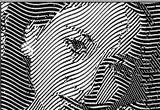
Bored at work.. thought it was a neat idea.. tada! I was at a loss for the background so I used T11's. Don't flame me too much

that actually doesn't look too bad. nice job.
Bored at work.. thought it was a neat idea.. tada! I was at a loss for the background so I used T11's. Don't flame me too much
Even if i can, and i like your design, what can we do? Send the design to T11? It sounds good to me though...although i love my Viper

")